Choosing between em, rem, and px for font sizes and spacing can make a big difference in your web design’s responsiveness and accessibility. Here’s a quick breakdown of each:
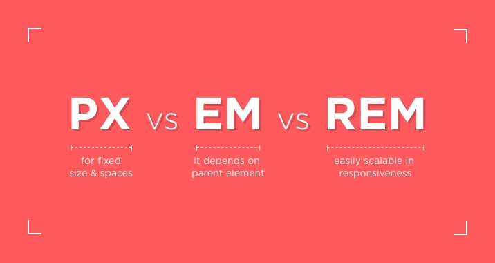
1. px (Pixels): Pixels are fixed units, meaning the size is absolute and doesn’t adapt based on the screen size or user settings. While easy to understand and use, pixels don’t scale well on different devices, making them less ideal for responsive design.
2. em: This unit is relative to the font size of the parent element. If the parent’s font size changes, the child element’s size will scale accordingly. This makes em great for nested, scalable designs, but it can sometimes be tricky to manage because changes in parent elements can cascade unexpectedly.
3. rem: Similar to em, but instead of being relative to the parent, it’s relative to the root (html) font size, usually set to 16px by default. rem is easier to manage because it remains consistent across the entire site, regardless of nesting, making it more predictable for global scaling.
Which to use?
– Use rem for consistent, global sizing that’s easy to manage and scales with the root font size.
– Use em when you want child elements to scale relative to their parent, especially useful for component-based designs.
– px is best avoided in responsive design but may still be useful in some fixed layouts or pixel-perfect designs.
Understanding when and how to use each unit can make your designs more flexible, responsive, and accessible across devices.
PX vs EM vs REM
- Nurul Hudda
- 11 Oct 2024
- Web Design
- 1 minute read