Did you know that you can improve your typography responsiveness in Elementor by using the clamp() function for font sizing? This CSS trick helps create fluid and responsive text that adjusts dynamically across different screen sizes without relying on media queries. Here’s how you can use it in Elementor:
1. Set a Minimum Size: Define the smallest font size that works well on mobile devices.
2. Set a Maximum Size: Choose a larger font size for desktops or wider screens.
3. Define a Scaling Value: Use a relative unit like `vw` (viewport width) to make the font size scale smoothly between the minimum and maximum values.
For example:
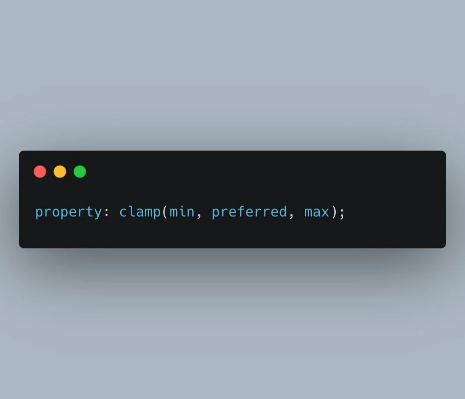
font-size: clamp(16px, 4vw, 24px);
This means your font size will scale between 16px and 24px, depending on the viewport width.
Using clamp() in Elementor’s Custom CSS allows your text to stay responsive, without having to define separate font sizes for each screen size in the Elementor editor. This is a great trick for keeping designs consistent and fully responsive. Give it a try!